Edit Mode
Users with the privilege Customize Wallboards may edit a wallboard’s layout. If you have been granted the privilege, your wallboards will be displayed in Edit mode with wallboard control elements visible. You can select and edit various parts of the wallboard by clicking or mousing over them.
For information about granting privileges for customizing, pushing, and pulling wallboards, refer to the Contact Center Administrator Guide.
Cells
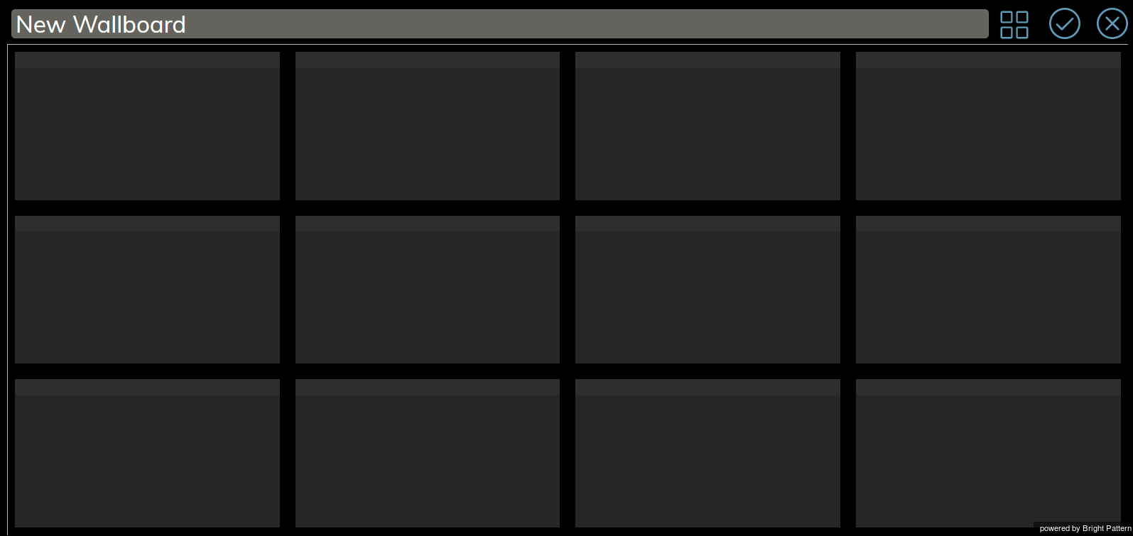
A wallboard is a grid of 12 x 12 cells, which contain information, stats, and metrics. When launching the Wallboard Builder application, if your wallboard has not been configured yet, you will see a grid of 12 cards and/or empty cells, as shown.
If you have the privilege to customize wallboards, the wallboard will be shown in Edit mode, and mousing over a card or cell will enable you to click to edit it. Clicking on any cell creates a new 2 x 2 card if there is space available. It is also possible to create a card by click-dragging across cells.
Note that the size of the card is a multiple of grid cells, and the minimum card size is 2 x 2.
There are two standard color schemes from which to choose: dark (black background and grey cards) and light (light grey background and white cards).
Cards
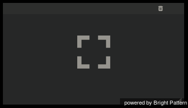
When mousing over an empty card, graphics for editing the card appear. At the center of each empty card is a “focus bracket” that shows where a card can be placed.
When clicked, the plus sign graphic will show a widget selector that allows you to choose the type of widget to be placed in the card.
To delete the card and its contents, if any, click the Delete ![]() icon located in the upper right-hand corner of the card.
icon located in the upper right-hand corner of the card.
Resizing and Moving Cards
In addition to changing a card's contents, it is possible to change a card's size and placement on the grid.
To resize a card:
Click and drag the corner of the card until it is the desired size. Note that a resized card cannot overlap with another card on the grid.
To move a card: Drag and drop it onto an empty space on the grid. As with a resized card, a dragged card can be dropped onto empty spaces only, and the cards cannot overlap.
Widget Selector
Widgets are used to display metrics, statistics, news, and other specific information in real-time on your wallboard. Widgets are added to cards on your wallboard using the widget selector. Mousing over a widget highlights it.
The widget selector groups widgets into these various sections, enabling quick selection:
- Basic Widgets
- Аgent stats
- Service stats
- Team stats
- News
- Agent State Summary
Widgets from other wallboards are shown in the widget selector according to their configuration and titles.
To select a widget and add it to a card, click on a widget shown in the widget selector. A widget configuration screen will open, presenting widget-specific properties and settings to edit.
Cards that already have defined widgets will display a Delete icon, a Configure icon, and the title and actual data for the widget according to its configuration.
Scalable Display
When displayed, a wallboard scales to the all available space on the Agent Desktop. This means that cards do not keep their aspect ratio (e.g., it is impossible to ensure that cards are always square). Widget content is scaled according to the widget design.
The selector dialog can expand vertically to fit the Agent Desktop. If there are too many items in a section, a scroll bar appears.


