From Bright Pattern Documentation
Contents
- Introduction
- Form Builder Application
- Form Components
- 1 Label
- Picture Static
- Hyperlink
- Call Number
- Disposition Button
- MediaPlayer URL
- Disposition System
- Complete System
- Notes System
- Voice Signature System
- Add Activity System
- Reminder System
- Field
Form Builder Reference Guide
Label
The Label component is used to add text to your form, such as headings, instructions, and help text.
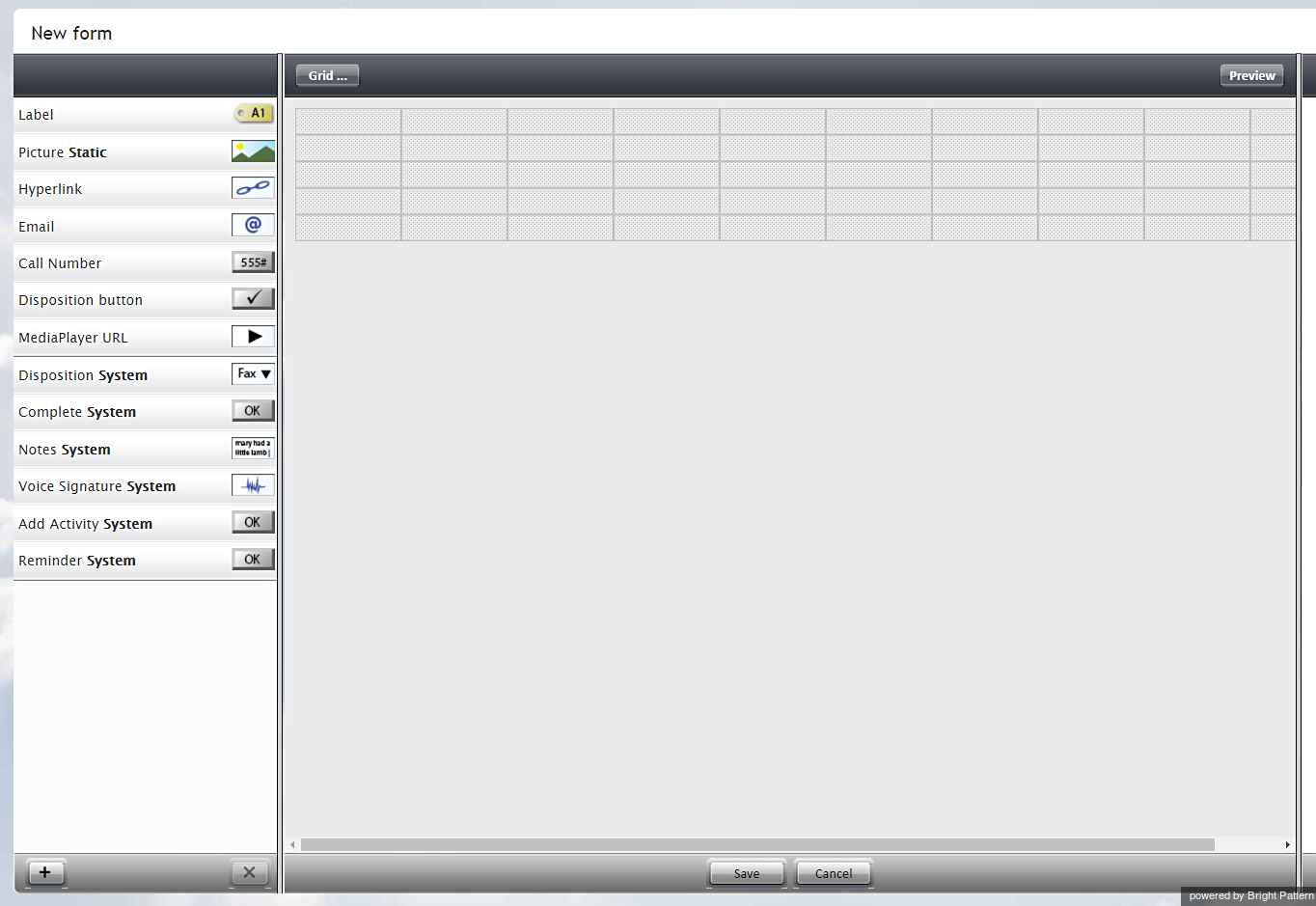
To add this component to your activity form, hold and drag the component from the component menu on the left, onto the blank form on the right.
Settings
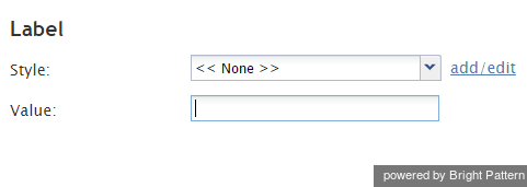
Settings must be specified on the pane that appears.
Style
Select or define the text style for this element. Choose from the following options:
- << None >>
- Text
- Title
- Label
- Hyperlink
- Note
Value
Enter the text to be displayed. All or part of this text can be a scenario variable in the $(varname) format.


