Contents
- Introduction
- Form Builder Application
- 1 Form Builder Overview
- Form Components
- Add Activity System
- Call Number
- CardNumber
- Complete System
- CVV Number
- Disposition Button
- Disposition System
- ExpiryDate List
- ExpiryYear List
- Field
- Hyperlink
- Label
- MediaPlayer URL
- NameOnCard Text
- Notes System
- Picture Static
- Reminder System
- SecureNote Text
- SSN1 Number
- Voice Signature System
Form Builder Overview
Bright Pattern Contact Center supports the creation of service-specific web forms that can be used to facilitate interaction handling. If a form is defined for a particular service, it will be displayed by the Agent Desktop application when a corresponding interaction is distributed to the agent. Activity forms can be pre-filled with data from third-party databases (via scenarios) and from calling lists.
Activity forms associated with outbound campaigns can also be used for new data entry during active interaction handling and/or after-call work (ACW). Filled-out forms can be transferred between agents working on the same interactions. The data collected via editable forms can be stored as part of the campaign results and is available for offline processing.
Note that editable forms are currently supported for services of Outbound Voice and Blended Voice types only. For all other types of services, static forms can be used (i.e., forms without any editable fields).
Activity forms are designed and edited in the application called Form Builder. This application is launched from the Contact Center Administrator application. For more information, see section Activity Forms of the Bright Pattern Contact Center Administrator Guide.
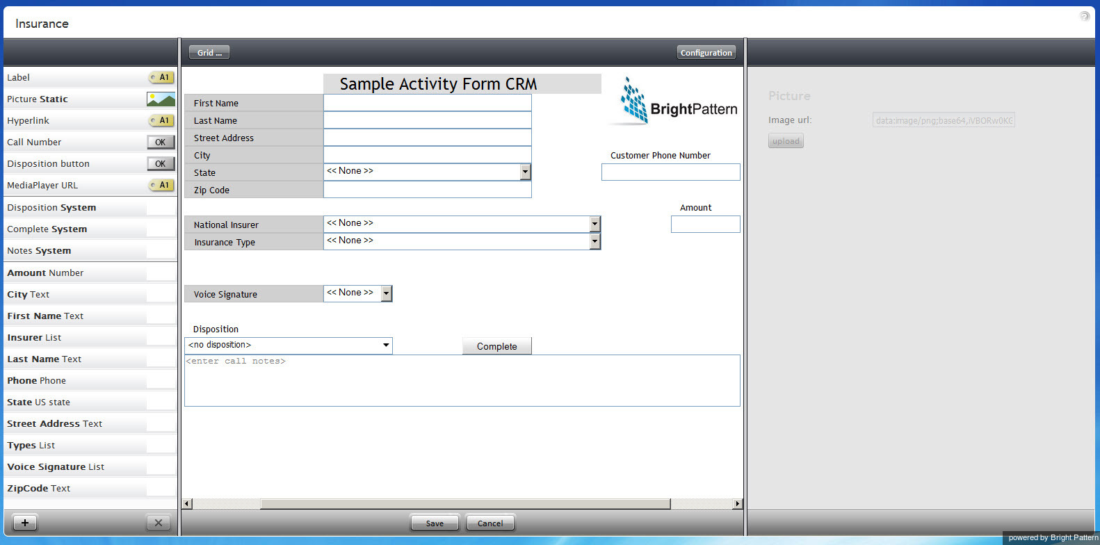
Form Builder provides a graphical user interface (GUI) that allows you to place various user interface (UI) elements to desired locations on a page and edit their properties, thus building your form. A form can incorporate various types of UI elements, such as static text, data fields, and pictures.
Each type of UI element, called a form component, has its own configuration attributes, which appear in the edit pane when the element is added to the form or selected within the form. The attributes specify the function performed by the form component. For example, a data filed has attributes that specify the data type (text, number, etc.), the default initial value, and indicate whether the data in this field is read-only or can be edited by an agent.
The Form Builder is divided into the following areas: the form component menu, the canvas, and the properties editor. To define a new UI element for your form, select the corresponding from component from the menu, drag it to the desired location on the form canvas, and specify its properties in the property editor.
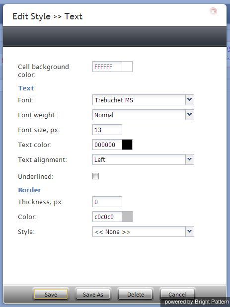
Note that all form components that may have text in them have a common property called Style. Styles control appearance of the static text on your form, such as font type, font size, text color, and alignment. Bright Pattern Contact Center software provides a number of predefined styles that you can select from the drop-down menu. You can edit any of such predefined styles, or you can create your own styles from scratch. Select the style that you wish to edit from the drop-down menu (to create a style from scratch, select None), click add/edit, and specify style properties.
Note that values of many form components can be defined as scenario variables in the $(varname) format.
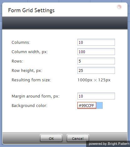
Use the canvas grid to organize UI elements on the form. You can change the canvas attributes--including the grid parameters, margins, and background color--by clicking the Grid button.
After a UI element has been placed on the canvas, you can resize it by dragging one of its sides (or corners) in the desired direction to occupy adjacent grid cells. You can also change the position of the component on the canvas by dragging it to another location.
To see how your form will appear in the Agent Desktop application, click the Preview button.
The subsequent sections of this guide describe specific form components, their attributes, and usage. The components are listed in the order in which they appear in the menu.


