Goto Page
GoTo Page is essentially a button that directs a user to another page of a form. This component is useful only for multi-page forms.
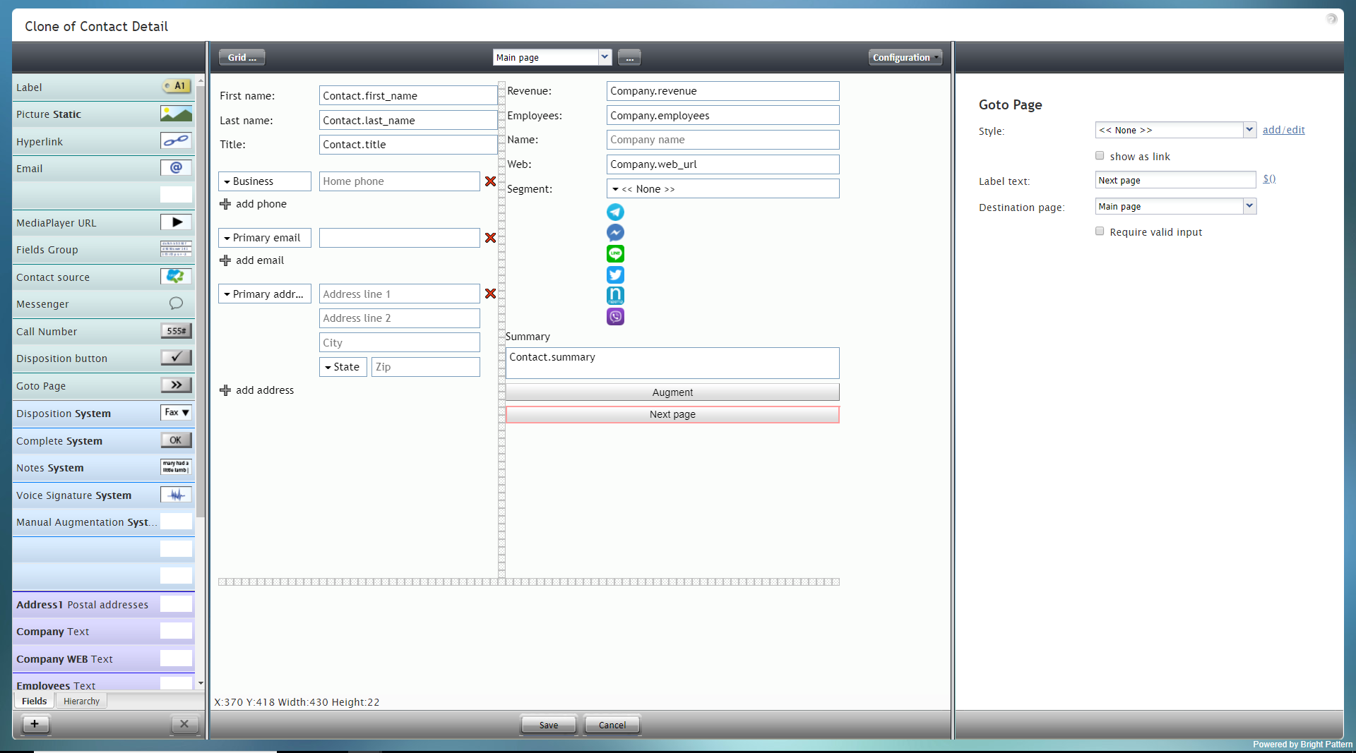
To add this component to your form, hold and drag the component from the component menu on the left, onto the blank form on the right.
Note: This control is supported in version 5.x for forms created in the Form Builder application version 3.x.
Field Properties
This component's field properties are described as follows.
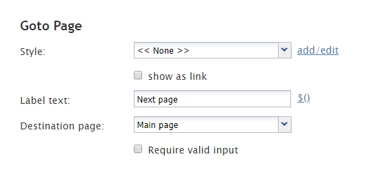
Style
The Style property allows you to change the way that a control element appears on a form.
You can select a style from the following options:
- << None >>
- Text
- Title
- Label
- Hyperlink
- Note
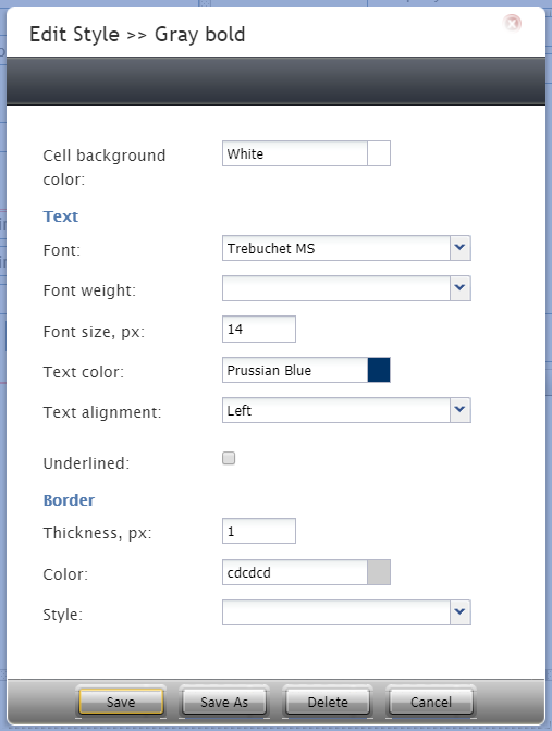
You can also click add/edit to add another style or edit the selected style, choosing from different fonts, sizes, colors, and other style elements.
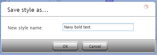
Clicking Save as allows you to name and save the style you just added/edited, and that style becomes available in the drop-down selector for the Style and Edit Style properties.
Edit Style
The Edit Style property allows you to select the style defined in the Style property. The style you select here is what is shown on the form.
show as link
Select the checkbox for show as link in order to have the Label text appear as a hyperlink on the form. Users can click the link to go to the specified form page.
Label text
The Label text is the text label for this control, and it is shown on the form itself. For example, specifying form label "Next page" will display "Next page" on the control.
$()
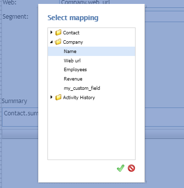
Click $() to add a variable to the label text that appears on the GoTo Page component. After clicking, you can select a specific data field to map to the field.
Display Type
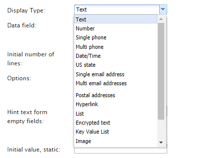
For this control, the display type is automatically set to None. Note that there are many other display types from which to choose.
Destination page
Destination page is the page where the user will be directed upon click. Using the drop-down selector, select the desired page. Note that the selector shows only the pages available for your form. If you do not see any pages besides "Main Page," you should add a page and try again.
Require valid input
Select the checkbox for Require valid input to have the system check that there is indeed another form page for the user to view.

