Contents
- Introduction
- Form Builder Application
- Form Components
- Add Activity System
- Address1 Postal Addresses
- Call Number
- CardNumber
- Company Text
- Complete System
- 1 Contact Source
- CVV Number
- Disposition Button
- Disposition System
- Employees Text
- ExpiryDate List
- ExpiryYear List
- Field
- Fields Group
- First Text
- Goto Page
- Hyperlink
- Label
- Last Text
- Manual Augmentation System
- MediaPlayer URL
- Messenger
- NameOnCard Text
- Notes System
- Phone-home Multi phone
- Primarymail Multi email addresses
- Picture Static
- Reminder System
- Revenue Text
- SecureNote Text
- Segment Key Value List
- SSN1 Number
- Summary Text
- Title Text
- Voice Signature System
Contact Source
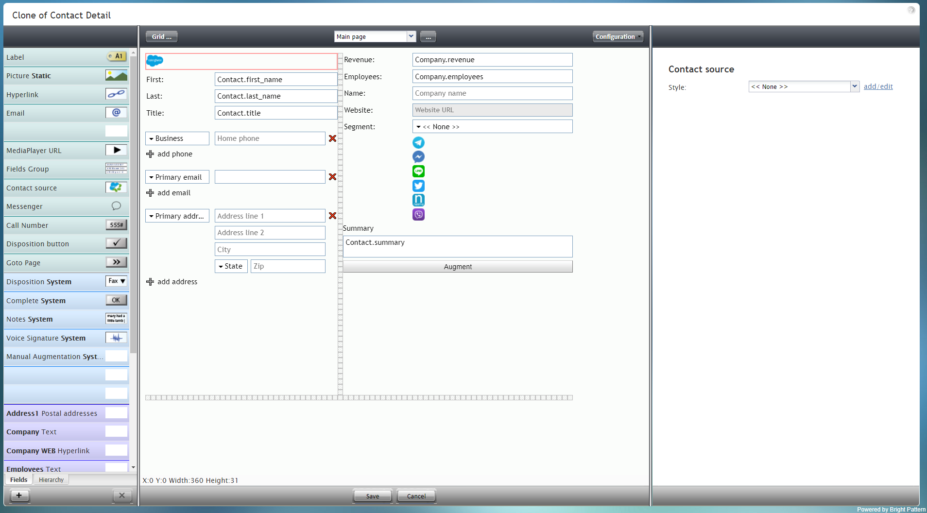
Contact Source is a special type of control that displays an icon if the contact was imported from an external CRM, such as Salesforce.com. In the example form shown, the Contact Source control displays the Salesforce icon and is outlined in red.
To add this component to your form, hold and drag the component from the component menu on the left, onto the blank form on the right.
Note: This control is supported in version 5.x for forms created in the Form Builder application version 3.x.
Field Properties
This component has only one property that can be changed: Style.
Style
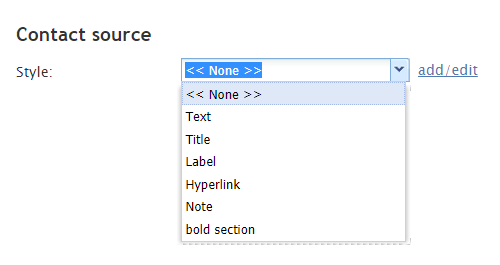
The Style property allows you to change the way that a control element appears on a form. For this component, you may not wish to use any style at all because the control is displayed as a small image. The default style for this control is None.
The other style options include:
- << None >>
- Text
- Title
- Label
- Hyperlink
- Note
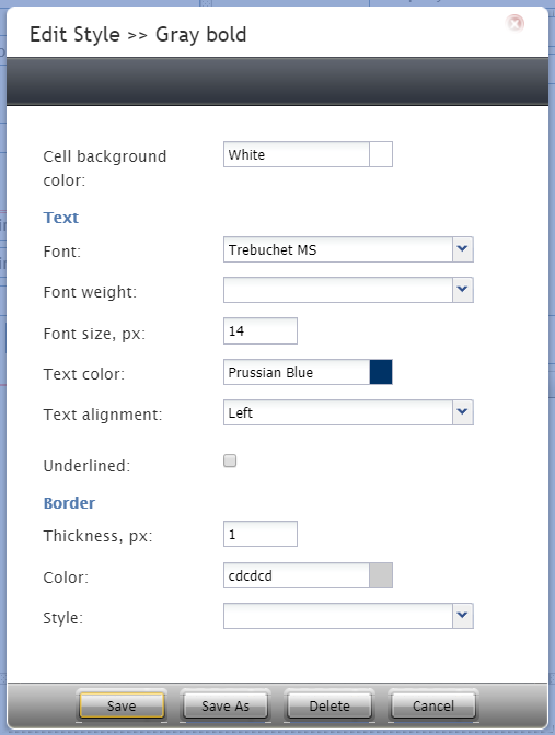
You can also click add/edit to add another style or edit the selected style, choosing from different fonts, sizes, colors, and other style elements.
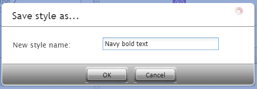
Clicking Save as allows you to name and save the style you just added/edited, and that style becomes available in the drop-down selector for the Style and Edit Style properties.


